
Ophy Care:
Localizing Telemedicine
Challenge
What features are essential to a telemedicine platform that is specifically created to meet the needs, concerns, and frustrations of non-native English speakers?
Ophy Care (formerly EZ Health live) is a telemedicine company founded in 2020 through the Start-up Laboratory at Columbia University. Its aim is to provide telemedicine services exclusively for under-served, non-native-English-speaking communities across multiple languages, including Arabic, Spanish, Mandarin, and Urdu. Through access to a multilingual medical team, patients can meet with physicians of similar linguistic and cultural backgrounds, receiving all medical communications in their native languages without the need for external translators or intermediaries.
But who, in fact, are Ophy Care’s users? What obstacles to acquiring medical attention currently stand in their way? And what aspects of their user experience are fundamental to helping them achieve their medical goals?
As research lead on Ophy Care’s initial product team, I was responsible for acquiring insights into the essential needs of its users and translating these insights for the design team.

Process
We began by developing a research plan aimed to better understand the current state of Ophy Care’s platform and their target audience, arriving at a 4-stage methodological approach:
A heuristic evaluation to understand how effectively Ophy Care’s current website was communicating with its current and prospective users.
A series of semi-structured interviews to understand the goals, needs, and frustrations of these users as they applied to telemedicine services.
User personas to help direct the scope of the design process.
Moderated usability testing to determine whether our newly informed designs met the expectations of our target audience members.
Methodology

We conducted a heuristic evaluation to evaluate how effectively the existing version of Ophy Care’s website communicated the company’s mission and provided access to its services.
Three aspects of its home page were determined to be problematic:
Heuristic Evaluation
The main heading, “Talk to a Doctor in your Native Language”, provided some indication of EZ Health’s services, but fell short of explaining what set the company apart or made it unique.
While the language selection field had a prominent role in the home page, its placement in between the main heading and sub-heading created too much cognitive load for non-English speakers entering the site for the first time.
The ‘Join Now’ button was consigned to the upper right-hand corner of the home page, making it less prominent than it should be for first-time users.
The website’s registration process was also problematic in three ways:

The opening form contains 12 fields, several of which could easily have be added to later stages of the overall registration process.
The form’s contents lacked a familiar organization; for example, the username and password creation fields were separated by unrelated fields (date of birth, phone number, etc.), causing the user to alternative between different types of cognitive tasks.
The page also lacked any indication of how many stages were involved in the registration process, leaving the user to guess the time commitment involved in completion.
Another key consideration missing from Ophy Care’s original design was accommodation for right-to-left language speakers, a key constituency of their target audience.

Our literature review provided 3 core insights that influenced the subsequent design process:
The content of the website needed to be in a default centered position to prevent linguistic bias against RTL speakers coming to the website for the first time
The informational architecture needed to be determined from the outset in order to avoid linguistic conflicts when switching from left-to-right to right-to-left languages
Because the majority of people around the world are right-handed, icons (e.g., a search bar, pen/pencil) should still reflect this orientation
Our interview process involved 13 participants consisting of the following:
8 non-native-English-speaking prospective patients across 4 languages (3 Arabic, 1 Mandarin, 2 Spanish, and 2 Urdu)
5 family members who regularly serve as medical translators or intermediaries for family members (in most cases, their parents)
User Interviews
Subsequent affinity mapping revealed three dominant themes.

1. Comfort: Paramount amongst patients needs was a sufficient level of trust - one that could only be achieved through direct communication in their native language with a physician who shared their linguistic and cultural background.
“It’s no one’s fault, but it’s intrusive to have others communicating your problems to the doctor - especially a doctor who doesn’t understand your culture.”
2. Transparency: patients’ financial concerns stemmed in large part from their linguistic insecurities. Many were worried that they would fail to understand the terms of agreement or would unwittingly commit to costs hidden by linguistic subtleties.
“It’s hard to make a commitment when you have to rely on someone else reading the contract and getting it right.”
3. Expertise: the main concern of family members centered on their role as medical intermediaries. Many expressed anxiety and frustration over having to play the part of medical translator when they themselves lacked any medical expertise.
“At the end of the day, I’m not a doctor. It’s hard to know if I am translating terms the right way and there’s a burden that goes along with that.”
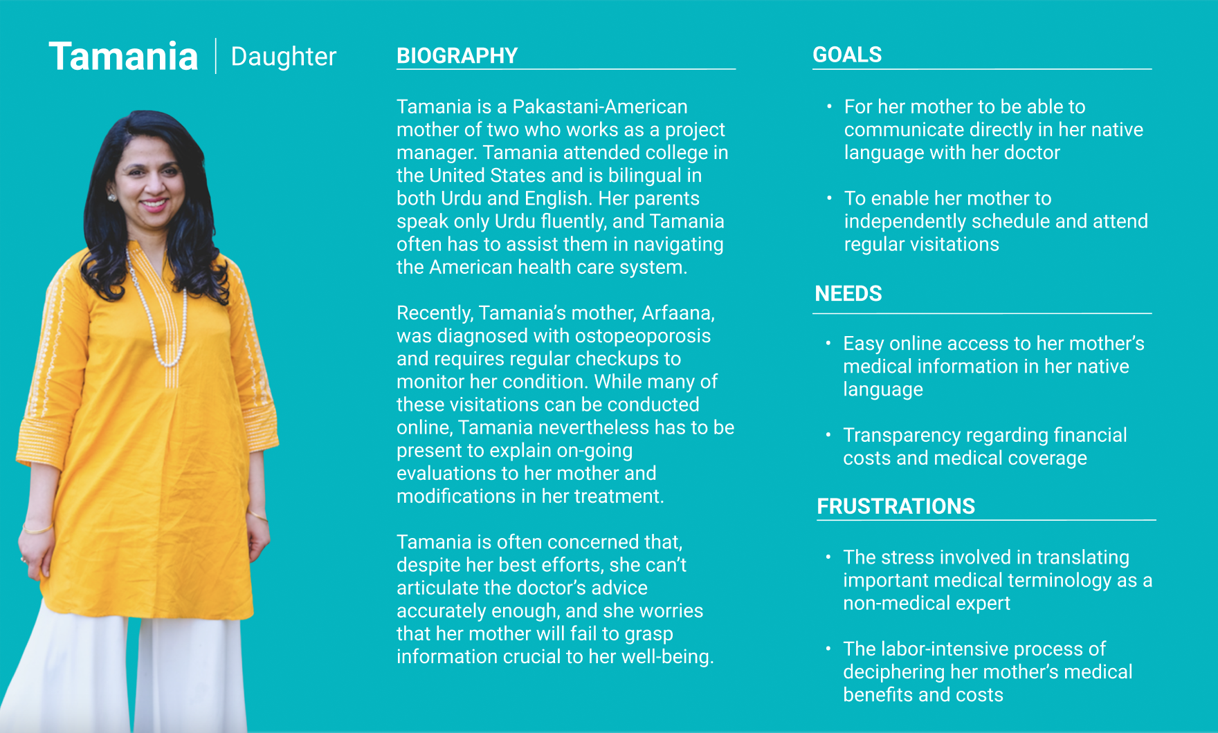
We developed two user personas to represent our two groups of interviewees.
Our primary persona, Manuel, represents the prospective patient who is coming to Ophy Care for the first time. His main needs are linguistic and cultural accessibility and financial transparency.
Personas

Our secondary persona, Tamania, represents the family member who is navigating the site for a relative. She needs a service that will relieve her having to play the role of medical translator.
Insights
Our research yielded 4 central insights and corresponding design recommendations, which we tested through moderated usability studies with 7 participants.
Accessibility in Action
First in priority was the need to remove any language impediments during the user discovery process. It was vital to convey Ophy Care’s mission in action, i.e., to show how it provides a unique telemedicine option for its target users from their very first interaction on the website.
This required a language selection system that would be clear, simple, and immediately accessible to non-native English speakers. We tested two different options:
A homepage with a language selection icon in the upper righthand corner; and
The same homepage, but this time accompanied by a pop-up which appears 5 seconds after the user entered the website.
5 out of 7 of our usability participants saw value in the addition of the supplemental pop up.

Our participants liked the fact that the pop up (a) eliminated the work involved in finding the language selection field, and (b) prevented extraneous content from intruding on their language selection process. Our final design also represented users’ preference that the names of each language be written in their corresponding languages.
A Sense of Belonging
Our interviews unequivocally indicated that Ophy Care’s target audience lacks a sense of belonging in the telemedicine marketplace, and that there is a desire within this community for services that are specifically tailored to their needs.

We made (1) the main header and (2) the mission statement more prominent so that users would be able to immediately determine the company’s distinguishing features. We also created three straightforward Calls to Action, (3) “How Does it Works?”, (4) “What Does it Cost?”, and (5) “Join Now”, to provide users with immediate answers to pressing questions about the service.
Our research into design norms for right-to-left languages also recommended that the informational architecture of our prototype remain consistent regardless of language directionality, reinforcing to users the company’s commitment to accessibility across a wide variety of cultures.

A Patients-First Policy
Another main concern of prospective patients was financial transparency. This community is keenly aware that language barriers put them at a disadvantage, making them especially susceptible to subtlety-worded contracts. Respect is paramount for acquiring the trust of community of users, and this respect must be founded upon straightforwardness and clarity.

The remainder of the home page is constituted by 3 sections organized under the following headers: ‘What We Treat’, ‘Affordable Costs’, and ‘How it Works?’. These sections provide plain-language answers regarding the range of services, their associated cost, and how the service work.
Simplifying Registration
Our interviewees also expressed past frustrations with telemedicine services. Several explained why they ultimately abandoned their search; it was usually because the registration process was too long to complete in a single session, required too much personal information, and simply didn’t provide enough incentive from the outset to merit the requisite time and energy.

We split the registration process into manageable portions that could be completed over a period of time, and made it clear at each step how many tasks remained to the complete the process. We also explored ways to make the process as local as possible, by connecting patients with doctors and pharmacies in their immediate neighborhoods.
Results
Final Prototype

The study produced foundational insights into Ophy Care’s target audience, an overhaul of the company’s website, and strategic recommendations for future enhancements. The latter included a recommendation for an expanded patient portal that provides patients with, among other things, more personal and professional information about Ophy Care’s medical team members.